Showing posts with label Chameleon art products. Show all posts

Friday, September 01, 2017

Mix-Ability Challenge: The Layered Look

It's my turn to host the Mix-Ability challenge over on Splitcoast!


I've been spending several hours a week working on pet portrait commissions -- except this week - I was designing pretty Spring stamps for you! Anyway, my favorite way to work on these portraits is by laying down an underpainting with watercolor, and then adding details with colored pencil. Here's an example of what I mean -


This portrait started with a couple of washes of watercolor. The color of the underpainting is sometimes the highlight color of the area, and is what will show through between the pencil strokes.


It's also really helpful in darker areas, where you don't want any white to show through. The underpainting stage can be a bit of an ugly stage, but it builds a foundation, helps you to place colors correctly, and with a little work, the beauty will be in the details.


Here's my challenge sample - I've been playing with these new Color Tops from Chameleon, so I used them for my underpainting here. I used pencils to add a little more shading and some details to the image. The background was lightly brushed with IO Hybrid ink (safe with alcohol markers), and then I added some dotted acrylic paint for the snow.


Stamps I used: Little Red, Winter Silhouettes clear set
 Keep an eye HERE for Chameleon Color Tops coming soon!

Thanks for stopping by!

Wednesday, June 14, 2017

Splitcoast Tutorial: Pencil Indenting

 It's my turn to share a tutorial over at Splitcoast, and I wanted to take one more opportunity to show off the Chameleon Color Tones Pencils with a fun and easy technique - it's called Pencil Indenting, and it's a great way to add texture and finely detailed highlights to pencil coloring.


I chose a couple images from Unity Stamps by Phyllis Harris because her images always have such beautiful details and motion in them. (This set is called Life Is Better, and I used a sentiment from Inky Antics.) In this card I used the technique to add highlights to the little girl's hair and shirt and the puppy's fur. 


On the second card I used the technique to add a pattern to the girl's dress, then added highlights to her hair, the dandelion, and the seeds blowing in the air. (This set is called Every Breath and the sentiment is by Marcella Hawley.)


This was such a fun card to make, and the Color Tones pencils made color choices and shading so easy. I worked from light pressure on the image to very heavy pressure in the background, and they performed just perfectly.


I also used a battery eraser to add highlights to the images, which you'll see in the tutorial video - this is the one I have:


... and you can find it HERE on Amazon! I was playing with it today on PanPastels as well as Distress Oxide inks - it's a lot of fun and such a useful tool to have.

By the way - if you're interested in purchasing a set of Color Tones pencils for yourself, be sure to use this discount code!


Thanks for visiting me today!

Thanks for stopping by!


Wednesday, May 31, 2017

Product Review: Chameleon Color Tones Pencils

The Splitcoast Product Focus today is all about these Chameleon Color Tones pencils! I'm so happy to have had a chance to play with these. Here's what I know!


A few facts first, because these pencils really surprised me:

--Most split-color pencils we've seen have been scholastic quality. Color Tones are the first artist grade pencils of this kind. 

--They are wax based, and highly pigmented. The wax in the binder is harder than other wax pencils. It allows the pencils to keep a sharp point for much longer than other pencils in this category. The leads are very strong. And presharpened!


--The color cores of each pencil are bonded from end to end, so they are break resistant, even when dropped. The wood is high quality, and won't snag in a sharpener.

--I have to confess I'm always skeptical of new pencil collections, when there are such high standards from companies with centuries of experience. But... these pencils are manufactured in Austria, by a company who has been producing quality colored pencils for over 150 years


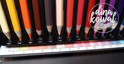
The packaging of the pencils is impressive from the start. The box is very sturdy, and closes with a magnetic flap. Once open, the box folds open under itself to create an easel for the pencils. So convenient. the case would be easy to tuck in a bag for a trip or coloring on the go.


Each pencil is also labeled with a number and both color names.


Each number corresponds to the color index that is included inside the box. 

I have done other pencil reviews, so I used the same chart for a few simple tests...  my scanner did some auto tuning which affected the lightest pressure area, but otherwise, the scan is pretty accurate.


You can see that the pencils are able to produce all shades (light to medium to dark) from each color, with very even coverage. I tried my 3 standard blending methods, and the pencils performed wonderfully. 

I shared my card samples in full in some blog posts last week, but here are some close-ups of each of them, with my thoughts! All the images were stamped on Strathmore XL Bristol paper - I love this particular paper pad because the paper has two different surfaces. I usually use the rougher side, but if you prefer smoother paper, or you're not sure which you prefer, you've got both options to choose from.


The sample above was colored with a single pencil, using both ends to layer color. It was very easy and felt really natural to just flip the pencil back and forth. The colors are so well matched, and blend together so easily.


The giraffe was blended in the same way - just lots of patient layering of color. I stamped this little guy in a light color for a no-line effect, and used both of the brown pencils (4 tones) to color him in.


I colored the snail image with a variety of colors, and blended my coloring with odorless mineral spirits - again, the colors blended perfectly and stayed vibrant because of the high pigment load.


The pencils performed well on kraft paper as well, and remained vibrant - I really like that effect.


 I was watching product videos from Chameleon that were taken at Creativation and one was a demonstration of the pencils being used on wood, so I had to try that out as well - and WOW! The colors blended well and stayed vibrant and true on the smooth wood surface. I'll have to try this again!


All in all, I'm so impressed with these pencils, and so thankful to have had the opportunity to play with them! Hopefully the line will expand to add open stock pencils and more colors - I'm not sure what Chameleon has in the works, but I do feel like these pencils are going to be a hit! :) 

Thanks for stopping by!

Splitcoast Tutorial: Magic Reveal Spinner Card

This week's tutorial over on Splitcoast is a fun interactive card called a Magic Reveal Spinner Card - the card has two layered panels, and the top one turns to reveal a hidden message or image beneath. So fun!


I used stamps from Verve on my card, and I'll tuck this one away for our card drive event in October. I colored the gloves using Chameleon pencils  and added a little background interest with some ink brushed through a strip of drywall tape.

Here's how the panel works - I actually made mine to open opposite from the one in the tutorial because the space worked better to the right of the slit with the spacing of the sentiment inside... that little gap is something to consider when you plan out your panels.


I love this set - it's so versatile, and what a great message!

Thanks for stopping by!

Friday, May 26, 2017

My Sweet Petunia and Unity swap hop!

I'm so thankful to be a part of a community that thrives on relationship and encouragement! It's so fun to be a guest in a joint blog hop with two companies that really live this out. Today I'm hopping with designers from Unity Stamp Co. and My Sweet Petunia! Keep reading for more info on how YOU could win a prize from one of these two companies! 

If you just happened on the blog hop today because you're a regular reader of my blog, and you'd like to view the entire hop, you can start back at the My Sweet Petunia blog - you'll find a full list of participants there, and all the details you need. If you're already hopping and you arrived here from Maria Levine's blog, you're doing just fine.


My samples are all colored using Chameleon Color Tone pencils, since I have a set here to review! It was nice to have such beautiful images to work with as I took the pencils through their paces. I also wanted to be sure to showcase how the stamps could be used with the MISTI, so I used a different technique with each of my cards. Here we go!


This is Grace Girl, a new addition to Angie Blom's signature line - I colored the image using a single pencil - the Color Tone pencils are double-ended, with a light and dark tone. For the background, I masked off the image, and positioned the sentiment stamp from the set toward the center of my MISTI. 


Each time I inked the sentiment, I moved the panel, stamping at even intervals to create a background. While the image was still masked, I brushed some of the same ink around the image to give it a warm glow.


This second image (Grace Upon Grace) is by Phyllis Harris, one of my favorite stamp artists! I used the MISTI to stamp the image in a dark brown ink, then moved the panel over about 1/4" and stamped in a light grey. This gave me a shadow to work with, and accentuated those gorgeous curls and the details of the fern branch.


I colored in the image in a loose, scribbly style. I love working this way - it's a little more abstract and fun.


For my third card, I blended the pencils with mineral spirits. This snail is the main image for a huge and wonderful sentiment set (Happy Snail Mail) that has all kinds of sayings for mail art, belated cards, and everything in between. This background is a Watercolor Imprint technique I've been working on - I'll share a tutorial on that in a month or two. This was one of my practice panels that was within reach, and I was so happy that it matched!


I wanted the snail image to be sort of 'borderless' so I used a light ink, but I also wanted his little eyes and antennaes to show. After stamping, I left the stamp in my MISTI so I could restamp in the exact same place. When I was done coloring, I put the panel back, and inked up just the eyes and antennaes with a black marker. 


I love that little trick - it really gives life to a borderless image!


Now for the fun stuff - thanks for hanging with me this far! 


Be sure to leave a comment on my blog and on the blogs of the rest of my friends below (look at them all - what a lot of talent in one list!!) Everyone who leaves a comment on all the blogs in the hop will be entered in a drawing for 3 prize packs from Unity and winner's choice of an Original or Mini MISTI from My Sweet Petunia! Please comment by May 30th at noon Central to be eligible. Winners will be posted on both the Unity Blog and the My Sweet Petunia blog on May 31st, so be sure to check back.

Thank you again for visiting me!

Thanks for stopping by!

Monday, May 22, 2017

Whimsy Stamps and Chameleon pencils!

I've been playing around with the new Chameleon Color Tones pencils for an upcoming review, and I was so happy to have more adorable Whimsy Stamps images to work with - if you haven't visited their site, be sure to take a peek! They have such a fun variety of stamps, just begging to be colored!


After months of waiting for April's baby to be born, this Baby Giraffe was an easy pick - isn't he adorable?


The sentiment above is from the set below - I have really enjoyed having a yard and garden at this house, so Penguin Gardener had to come and stay with me. :)


I love how these pencils performed on kraft paper, and I used a new-to-me toy that I bought for an upcoming colored pencil class with a local artist - it's a battery-powered eraser from Derwent, and it helped create the shadows in the white areas, and some of the highlights on the giraffe. Little bit of a learning curve, but so fun! Inexpensive too.


Check out the Whimsy site for all kinds of Customer Appreciation specials during the month of May! Have a great week!

Thanks for stopping by!

Friday, April 15, 2016

Cactus and Chameleon!

Each Friday this month the Impression Obsession team will be sharing projects using Chameleon pens, and the Chameleon team will be sharing projects using Impression Obsession stamps. It's so much fun to share! 


 I invested in a set of Chameleon pens last year, and they're a lot of fun to play with - I thought I'd try them out on a matboard Art Square from Inchie Arts, and I loved how easily they moved and blended. I like to layer multiple colors together, so I started on the flowers with the Fawn marker to create a shaded base...


...then went over the layers at a different angle with the Bubble Gum pink. I used 3 colors on the cactus to get the blend I wanted. It was a bigger area than I prefer for these markers, since the blending is done with the tip of the marker, but it worked out in the end.

For the background I used a waterbrush filled with rubbing alcohol to paint a texture - here's a quick shot (no sound) of how that works - the marker is just scribbled onto a ceramic tile and that becomes my palette.


I did a little sponging around the edges and added a few little highlights with a Posca pen, then assembled my card. I'm not sure what inspired me to stamp the cactus in green... stress brings out odd color combinations for me!


Stamps I used: Cactus Blossom, Hope Blooms (both from my stamp line)

You can visit the IO Blog to find links to today's projects - also, be sure to visit the Chameleon Blog to see their team's projects and enter for a chance to win a set of 5 Chameleon pens!
Thanks for stopping by!

Friday, August 07, 2015

DTGD + Mix-Ability: Waxing Eloquent

Today I'm hosting TWO challenges - it's my turn to host the Mix-Ability challenge, and time for the Splitcoast team to wrap up our week of challenges for Dare To Get Dirty. I can't spill the details of the DTGD challenge, but for Mix-Ability, the challenge is to use some kind of wax medium on your project.

Here's my card... I used a fun technique with MicroGlaze for the background - I love this stuff! Not only is it a wonderful sealer for pencil and watercolor work, it can be used for resist techniques, stamping, and so much more. Also - a little bit really does go a long way!

To begin, I colored my card using Chameleon Markers. and used more of the Chameleon ink to fill in the background using a waterbrush filled with rubbing alcohol. I laid a stencil over the panel and rubbed MicroGlaze through the pattern with my finger...


Here you can see the raised areas of MicroGlaze. This is a soft wax/petroleum product, and it would smear with too much brushing or pressure, but I don't want it to dry completely. Even 'wet', it will still resist a water-based medium.


I watered down some white acrylic paint on my craft mat, and very gently brushed it over the stenciling, letting the paint run down and around the pattern.


Once the paint was dry, I used a rag to just rub the MicroGlaze over the background - it gives it a finished look and a nice matte coat. You can also heat the MicroGlaze with a heat tool to let it melt and run - that's a fun look too (I played with it a little bit HERE).


Here's a closer look at the background - love the clean borders of the resist pattern.


...and a little more detail of the card design - stamps are from Unity Stamp Co.


Do have a wonderful weekend!
Thanks for stopping by!