


life stuff....rambling.
I just posted a little update on my health class over at our family blog, in case anyone was curious. I've been sick all week... I'm going to go take a nap!


I just posted a little update on my health class over at our family blog, in case anyone was curious. I've been sick all week... I'm going to go take a nap!
Got to thinking about the theme of 'March winds'... not sure why! March is almost over, so I'd better post this little guy! This is one of the Moments in Time stamps from Flower Soft - I am a huge sucker for images with back views of children, so the artwork in this line is right up my alley. I watercolored the image with reinkers and sponged in some clouds with a scalloped circle punch. There's a little bit of Flower Soft Earth Ultrafine, creating a border on his sweater vest - did you notice? Just a little texture to add to the scene. I stitched the kite string too. The buttons are 'threaded' with narrow strips of paper. Love those little details!
 We always have a good wind here when the seasons change. Is it windy where you are?
A couple of Spring-y cards for today, just for fun! I was showing one of my friends pictures the other day of fields of wild daffodils, and she was in awe - the breaking out of Spring is one of my favorite memories of the area of Missouri where we lived for 6 years. Daffodils, dogwoods, redbuds... anyway, here's a garden bench, and a pot full of daffodils to enjoy. And a bunny! This is Impression Obsession's Wire Garden Bench.  My first card was submitted for publication, but wasn't chosen - the image is watercolored using reinkers.
 This second card was made for CHA. I colored the image with Prismacolor pencils, and paper-pieced the pillow with a scrap of the background paper. I used Cover-a-Card stamps to create my own background paper (Reverse Damask, Canvas and Houndstooth).
 Happy Spring!!
Today's my last day to post over at the Sweet 'n Sassy blog... This is the card I've shared over there today. This isn't a new set, but it's my favorite of all my Sweet 'n Sassy sets.... Poppies & Greetings! I stamped the main image of the set in Versafine Onyx Black ink on a book page, then painted them in with white acrylic paint. I used Polar White Flower Soft and Martha Stewart glitter in the flower centers.  The center panel is stamped with the large poppies stamp as well as the smaller single flower. Here's a close up on the upper panel:
 Huge thanks to Korin and the SNSS team for letting me hang out with you this month!! Enjoyed it!
Time for another Hambo post... sooooo fun guest designing for them this month - thanks, Tim and Monica! My first card is a hybrid card... the storefront is a digital background (which is really handy and easy to resize for different formats), and the sentiment is stamped (you can find the Mime stamps at this link (I almost typed 'oink', which was unintentional, but... oddly appropriate!) - scroll down to the "Triples" section). All coloring is done with Prismacolor pencils. (Normally I'd have a list of colors that I used... it's lost somewhere on my desk! When I find that list, I'll add the colors in.) Oh, I did add the black border around the focal panel with a Touch marker... just needed 'something' to separate the colored panel from the pattern of the background paper but didn't want to add another layer. On the street area, I did a rubbing on the textured metal sheeting we have on the back of our bathroom door. I made a simple pop-up card, and in keeping with the mime theme, the card is otherwise blank inside. Hehe...!! I added a message panel on the back of the card just for fun.
 I made a quick one-layer card, too, while I had my stamps out. The image is colored with Touch Twin Markers. I masked off a circle and stippled around it with some yellow ink to create a little spotlight.
 Cute little sentiment, too. Thanks for visiting!
This week's Flower Soft Sprinkle challenge over at the Splitcoaststampers Forum (FSC25) is to use Flower Soft on your projects that feature animals. We'd love to have you join us, wherever that theme takes your imagination......remember you can win a prize for participating!
 I dug through some older stamps to find one I hadn't used for a while, and came up with this Orangutan from Biblical Impressions - how fun is he? Not everyone can say they have an Orangutan stamp in their collection, y'know... I watercolored the image using Derwent Inktense and watercolor pencils, and reinkers, and added some dimension to his face with a stylus from behind the panel.
I had a lot of fun filling him in with Ultrafine Flower Soft - I used Earth, Burnt Sienna, Toffee, and Sand. He's super fuzzy! The sentiment I used is from smARTworks.
I took some 'me' time to color this weekend - rediscovered this sweet image in my files from Mo Manning (occasionally she posts 24-hour freebies on her Facebook page, and this was one of those). I am still experimenting and practicing with my Touch Twin Markers... I know some people color from dark to light and others color from light to dark... I tried starting off with dark colors on this piece and working toward the lighter areas, which took a little thinking, but worked for me too.
(Is this a boy or a girl???) I added a little Flower Soft for dimension too: this is Autum Mix with Ultrafine Toffee. The sentiment is from Sweet 'n Sassy.
 Interesting weekend..... Thursday night I crashed into an unassembled bed frame DH bought from a neighbor and thought for sure I'd broken my toe..... it slowed me waaaaaay down Friday, which was probably a good thing (except that I had to cook for dinner guests...!). The pain has mostly gone, so I'm guessing it's just sprained. *sigh*
This is the card I shared over at the Sweet 'n Sassy blog today - I felt more comfortable taking up lots of page space on my own blog, so I'm posting more details here. I didn't take enough pictures during my process to make a tutorial - mostly because I wasn't sure what I was doing, just trying to work out the concept I had in my head! Hopefully, though, the pictures I have here will give you an idea of the structure of the card... and I'll take better pictures next time! :) Here's the assembled card: The images I used are from the new Circus Digital Collection - I love the digital format for this because it was easy to resize the big top for my card front. All images are colored with Touch Twin Markers. I made a basic easel card base first, which is a Z-fold (fold your card in half, then fold the top half back to the center fold. This is the shape of the card base - I followed the line of the big top until it came to a good place to cut straight, then continued the shape at the bottom. So old school with my pencil and scissors... sigh...
 This is what it looks like closed:
 For the inside elements, I created some pop-up tabs out of cardstock. I chose a strip about 3" wide, so I could cut several tabs from it and they would all be scored the same. I scored at 1/2", 1-1-2", 2", and 3", then left a little extra on the end. I cut off a couple of strips and folded them into rectangles, and overlapped and glued the ends. I held the animals upright and glued the rectangle square on the back with the bottom flush on my desk, then glued the bottom of the rectangles to the card base, lining them up with a ruler. I used Tacky Glue because it dries quickly and I had it handy... double stick tape should work too.
 The sentiment is computer generated, using a font called Ziggy Zoe... not sure where it came from, but it sure is cute!
 I hope that gives you some ideas for your shaped and interactive cards... if you have questions I'd be glad to try and answer, or experiment some more!
The Impression Obsession team's challenge today is use our stamps to create a non-card project. I've always wanted to try making a Magic Box - if you're not familiar with these, take a look through Elaine's beautiful website... mine is nooooowhere near as AMAZING as her creations are.... but I tried! (I just can't compete with someone who made one for the Queen...) Elaine has a very detailed tutorial HERE if you'd like to try making your own Magic Box... I did mine pretty much the same, except my strips of acetate are anchored under the side panels instead of cutting slits in the center panel.
I didn't spend a lot of time coloring on this project, and I only used 2 stamps. The flower stamp is called Delicate Daffodil and the sentiment can be found here. I started off with a square of paper 7" square and scored 2-1/2" in from each side, then cut out the corners of the square along the scored lines.
 Here is the box closed - when you pull the top off, everything just sort of 'sproings' - it was hard to get a good picture with all the flowers and butterflies bobbing up and down! Very fun project to make.
Be sure to check out what these other designers came up with for their "anything-but-a-card" project -
Daniela @ For the First Time
Jeanne @ Inky Paws
Julie @ Out to Impress
Kathy @ Watermelon Sugar
Kelli @ I Made This Myself!
Laura @ Laura's Stamp Art Journal
Shirley @ Card Art, Etc.
Remember you can enter these challenges too, using your Impression Obsession stamps! See the I.O. blog for all the details - you might even win a $25 gift certificate!! We'd love to have you join us.
The Flower Soft team is hopping today... today we're sharing projects that feature some of our new sets of toppers! If you arrived here from the Flower Soft blog, you're on the right track. If you just happened to stop by, you're in luck, because this is the first stop on the hop! And prizes are involved!
I'm sharing 2 cards today, made with Die Cut Dimensions Wildflowers. These sets are so much fun to work with, and versatile for so many types of cards or other projects. My first card was a quick one. I used the precut oval element from the kit, added dimension to the flowers with my ball stylus and some Polar White Flower Soft, and stamped a sentiment from Heartfelt Creations. Here's a close-up so you can see the dimension:
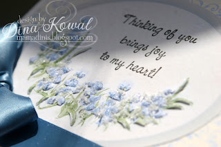 For my second card I used some of the stand-alone elements from the kit to create a border between my panels. Again, I used my stylus to add dimension to each piece before adding it to the card. I also used the ribbon element, and the edge of a paper doily for more of a shabby chic look. The sentiment is from Heart and Soul Rubber Stamp Co.
 As you make your way through the hop remember to comment on each and every post! There will be a prize winner chosen randomly among the blogs. One lucky blog hopper who comments on all the blogs will win a $50 gift certificate! The blog hop will remain open until 3/22. The winner will be announced on the Flower Soft blog on 3/23.
Flower Soft is sponsoring this week's sketch (#209) over at Card Positioning Systems this week - here's the sketch, and my card:
 I colored the image with Touch Twin markers, and a Sepia Prismacolor pencil, probably a little watercolor pencil in there, too! Can't remember now... I had started coloring the image back in January. :) This is Daisy, from Sugar Nellie, available through Funky Kits. I used Citrus Crush Ultrafine Flower Soft to accent the flowers and wreath and fill in the button.
 I so love this image... it's a good reminder to me that I need to take time to stop and be still on a regular basis. My next 4 weeks are run-run-run... I sincerely appreciate your prayers for my sanity! Preparation for health class, handbook revisions, a couple other teaching opportunities to prepare lessons for, campus guests from out of the country, dinners... on top of the 'usual' stuff. My tendency is to not handle stress well... so I need to be sure to pull away each day for some quiet time.
This month I'm excited to be doing a couple guest posts for Hambo Stamps! Their stamps range from cute to incredibly punny, the creative genius of Tim and Monica Hunter.
I chose this elevator digi set to work with first - because it cracked me up. My Dad's family members are all hopeless punsters, and it passed on to my brother and me as well. So the elevator set, with its sentiments, "Feeling down?" and "Thought you could use a lift!" really hit the right button with me. (ba-dum-pum.) Coming up (*groan*), some of the steps I took (sorry, I can't help it).......... I printed the elevator image several times on patterned paper and pieced the scene together, then die cut all the layers at once.
  I added height (sorry) with foam tape, and also by embossing and scoring. There is Crystal Laquer on the dial and the buttons. I carried a couple of elevator themes to the card front too - the 2 buttons.... and the music!
 The inside sentiment was cut out with a Spellbinders tag die, which also holds open the easel card (oh man, that one was unintentional!).

Just for the love of butterflies, some bloggers are linking up for a butterfly blog party today! We'd love to have you join us - you can find all the details and a complete list of links over at Eva's blog! I inherited my love of butterflies from my Mom - in fact this is her birthday card... and it will be a little late! (I did remember to call though...) Her birthday was on Thursday. Happy birthday, Mom!
I used one of the newest sets that I designed, available from Our Daily Bread designs, called Faith (coincidentally, that is my Mom's name too...!). I stamped the Butterfly Branch several times along the side of my watercolor paper, watercolored using reinkers, then covered over all the watercolored areas with Sakura Glaze pen. When that was dry, I inked up my Brocade Background with Sand chalk ink (Versamagic), misted the stamp, and stamped it over the panel. I also used my favorite brown blow pen to add some speckling to the left side of the panel. I cut the frame out of a cereal box, painted it white with acrylic paint, then hit it with my Sand ink pad. That frame is part of a Christmas Frameabilities set, but I don't think the holly is too noticeable! (Well, it is now that I told you...) While I had everything out from the first card, I saw the newest color challenge over at CR84FN (#18 - yellow, orange, and kraft), and had to try it out as well.
 I used the same method on this card, except on this one I cut around a few of the wings and popped them up. Note to self: that is way easier to do before assembling the card!


