No-line inks - a quick comparison
I wanted to share the results of a little ink experiment I tried last week! If you've tried any no-line coloring techniques, you might have been curious about what inks work well. I had heard so much about the Fadeout ink from Ink On 3 - and was purely curious how it compared in color to the lightest neutral inks I could think of in my collection, which are these:
The Fadeout ink is the newest pad of these 5 at my house, which are all hybrid inks from the same manufacturer, branded by Impression Obsession and My Favorite Things. I noticed one major difference in these swatches, though - do you see it too? I noticed right away that the Fadeout ink softened and blurred out just slightly as it dried, while the other swatches show the streaks from the edge of the felt pad. (It reminded me of the Memories Shadow inks - do you remember those? They all softened as they dried.)
I narrowed my testing down to the Fadeout ink and Impression Obsession's Mist ink, since they were the most similar in color. I stamped out 2 sets of snails and noted a difference in the stamped images as well, which you can see above. Notice again that the the Fadeout ink dries to a softer outline, and the Mist inked image is more crisp.
I colored the first two snails with Zig markers. The very first thing I noticed is how the outline pops when it's covered with a wet medium. I thought at first this was a reaction with the paper, but it turns out that is an intentional feature of the Fadeout ink, and apparently it's a 'hybrid thing', since both inks reacted in the same way. The neutral ink takes on any color that goes over it, which takes the guess work out of no-line coloring when you use a watercolor medium. (Copics or pencils will cover the lines, if you want to truly end up with "no lines" when you're finished.)
I did my best to color both images the same way, layering and blending colors to build up the shading. I colored the second set of snails using QoR watercolor paints.
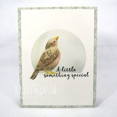
I'm glad I took the time to test these inks together... I wasn't looking for a 'winner' - I just wanted to know why I might use one or the other, and maybe find properties that differed. And I did! This is why it's important to test and experiment with your supplies, and the reason that I share my results. One day I might prefer a softer outline for no-line coloring; another day I might want a crisp outline. And truly, most of the time it probably won't matter. :) Here's a card I colored with pencils, and I don't even remember which ink I used! Isn't that bird so sweet?
Here's an unedited scan of the snails, done after 24 hours, since that was a recommended wait time on the Fadeout ink - you can click on it for a larger view. Though the name suggests it, the Fadeout ink is not a disappearing ink, and my results here definitely have lines... but I did learn a few things!
Hope this post was helpful - what do you think? Have you tried no-line coloring? Which results do you prefer?


Thank you for posting this article, very informative. Answered a few of my questions about this ink brand. I don't mean to sit on the fence but I think both inks have their advantages for use, all your images look fabulous.
ReplyDeleteThanks Dina, this was great. I just purchased the Fade Out Ink and have been playing with it, but I kinda like the effect of the IO Mist Ink also.
ReplyDeleteGreat blog post! I was so happy to see that you noticed the softness that comes with the Fadeout No Nine Coloring ink. It is a feature that was very difficult to create and purposely formulated that way. That along with it's a completely neutral color like no other, in that it will work with both warm and cool colors. It literally took me a year and a half to develop the Faderout Ink, as I was very picky and wanted the color and formulation to be very specific. <3 The Fadeout ink was a work of love for me. It literally is my craft baby! lol
ReplyDelete