Monday, June 30, 2014

Power Poppy Release: Countryside Bouquet


It's been a while since I got to hang out with the Bloom Brigade at Power Poppy, so I thought I'd jump in on today's release! This image is gorgeous... and since I requested the California Poppies, it's pretty special to me. When we're overseas and I get homesick, you'll see more poppies on my cards. When we arrived in CA in April they were blooming for me - what a welcome!


I'll share a little more of the process behind this card in a couple of weeks - I'm excited! It was colored with Touch Twin markers, and the colors I used are below. One great thing about digital stamps is the ability to resize them, and I love BIG floral images, so I made this beauty BIG! I actually got two cards out of the one image by printing it this size.


This Countryside Bouquet image is in the Power Poppy store now!

These are the Touch Twin Markers that I used - the card I made from the other side of the image was needed for a sympathy card, so I wanted softer tones:


Thanks for visiting me - I hope you'll take a peek at the beauties my friends have created too! Their links are below. Have a beautiful day!
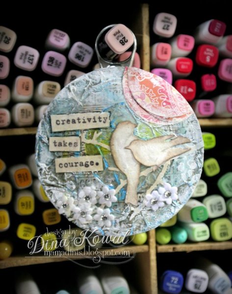
Thanks for stopping by!


Friday, June 27, 2014

Mix-Ability - Part of the Package

It's my turn to host the Mix-Ability Challenge over at Splitcoast, and this week we're using a piece of packaging, either as a tool to create our projects or as an element of our projects. Here's a fun little patriotic card I made using a new sentiment from Impression Obsession, a mixed media background, and some tiny star dies.


The silver stars are cut from aluminum tape I've been using for an upcoming tutorial video. Here you can see that I stamped parts of the background with white acrylic paint using some bubble wrap. This background started as a piece of white watercolor paper... I keep a few 1/4 sheets near my craft sheet and just wipe them through extra ink or paint when it's left over. It gives me some interesting ready-made layered backgrounds to work with in a pinch!


There are lots of ideas for interpretation listed on the challenge post. I thought I'd collect  a few older projects together to show some fun examples in one place. If you'd like to know more about one of the projects below, click on the link to read the original post.

Here's a background made using acrylic paint and plastic wrap:


...a picture frame made from a cereal box and tissue paper:


A card made with tinfoil and a cereal box:


A hanging made from the tabbed top of a snack canister:


So many ways to play! Hope you'll join us!
Thanks for stopping by!

Wednesday, June 25, 2014

Splitcoast Tutorial: Heated Copper Accents

Today's tutorial is brought to us by Loll Thompson! Some of her fans requested a tutorial on one of her signature techniques - her use of heated copper on cards. I hope you'll check out her tutorial - she has some beautiful samples, and she got to use a blowtorch!

I purchased a roll of .003 mm K&S Precision Metals copper at Hobby Lobby. I wanted to try Loll's technique using my heat gun to see what effect I got... because sadly, I don't have access to a mini blowtorch. I was able to get the color of the copper to change, but it did take longer than in her demonstration, and the color contrasts aren't as sharp. It's pretty anyway - I love that pink!


I used a steel rule die from Sizzix that cuts several flower sizes, so here's a quick peek at how I cut and shaped the copper after heating it up. I cut between each petal toward the flower center with scissors...


...then used a pencil to curve each petal down. On the smaller flowers I used some round nose pliers to do this.


There are 4 different layers to the flower, put together with some hot glue.


Here's my completed project - I used Impression Obsession's House die to cut a piece of copper, heated it, then layered it over another house cut from chipboard. I stamped with Stazon ink, embossed the roof portion with a Sizzix folder. I covered a small area with white acrylic paint, and used die cut letters to spell 'home'. The branch die is from I.O. too.


That's it! If you're interested, I hope you'll give the tutorial a try - at least go see Loll's cute little blowtorch!
Thanks for stopping by!

Monday, June 23, 2014

Bless this mess...

Well, I meant to share a card today, but it wasn't meant to be... I've been up to my ears in projects I can't share with you just yet! Here's my desk right now, and this is actually mild... the area in the foreground is where I do my videos, so that's why it's clean except for that blob of paint and what the camera can't see...


On the other side of the closet I've got backgrounds all over the floor, waiting to be matched with new Impression Obsession images (!!). I'm also trying to wrap up a video tutorial that I'll share in a couple of weeks, and have some other projects I need to work ahead on for July. Ack!


I'll be back Wednesday with a fun project to share!
Thanks for stopping by!

Saturday, June 21, 2014

Mix-Ability - Circles

Lydia's Mix-Ability challenge for us this week is to create a free-form design using circles. I did that......... and then I covered it up! I will learn... someday... to have the camera running when I do backgrounds, even when I have no plan for the process. I apologize!


My background panel is watercolor paper, and I used my favorite homemade chipboard circle stencil for the first layer of color. I spritzed water through it so I had a bunch of fun wet circles, then dropped ink into the circles and let the colors blend and bleed as they were drying. I rotated the stencil 180 degrees, and used Gelatos to create another layer of circles, which I spritzed and blended with my finger. After that I brushed white paint over the panel randomly.

When the panel was dry, I ran it through my Big Shot with a Darice embossing folder - more circles! So sorry that it's all covered up.


This sweet summer image and the sentiment are coming soon from Impression Obsession!


I used Touch Twin Markers to color in the image - these are the colors I used. The water was 'watercolored' with ink from the markers, using an alcohol-filled waterbrush. (That tutorial's HERE.)


There's a Sand challenge over at Splitcoast this week too - I used Flower Soft to add some sandy texture to the corner, and modeling paste and glitter for the waves.

Join us!
Thanks for stopping by!

Thursday, June 19, 2014

Impression Obsession DT Challenge: Are we there yet?

The Impression Obsession team's challenge today is to create a project with a travel theme. I picked a few images from my last Asian release! I shared a sneak peek of this card a couple of weeks ago - here's the completed card. This is a sample I made for my post on how white pencils perform on black or other dark surfaces. This is a black matboard ATC from Inchie Arts.


I stamped the Chinese Lanterns image first using white Memento Luxe ink, then masked the blooms to stamp the background. The next step was a *whoa*... I wanted to use PanPastels to highlight a background image stamped with Versamark ink, but did not anticipate the intensity of the white. WOW! The coverage was a lot more than I expected, so I wiped and erased a bit. The technique did work though!

The image is colored with a white Prismacolor pencil. As I mentioned when I showed the peek, this type of coloring is so challenging for me, because I'm accustomed to NOT coloring highlights.


I added a little more stamping (Chinese Script Background) around the panel in black, and edged it with more PanPastel in white.

Be sure to check out these other designers' blogs for inspiration -

Anna @ Sassy & Sweet Notes
Daniela @ For the First Time
Dina @ Mama Dini's Stamperia ---- you're here
Ellen @ The Serendipitous Stamper
Jeanne @ Inky Paws
Jenny @ One Krafty Kat
Kittie @ Kittie Kraft
Laura @ Laura's Stamp Art Journal
Vicki @ Summerthyme Studio

Remember you can enter these challenges too, using your Impression Obsession stamps! See the I.O. blog for all the details - you might even win a $25 gift certificate!! We'd love to have you join us.
Thanks for stopping by!