
One last Halloween card.......
........just a quick fun tag.

No surprises (or tricks!)...... I colored the moon then covered it with a Sakura Glaze pen and sponged the rest of the image panel.
Stamps I used:
 Be careful out there!


........just a quick fun tag.
No surprises (or tricks!)...... I colored the moon then covered it with a Sakura Glaze pen and sponged the rest of the image panel.
Stamps I used:
Be careful out there!
 Gail's images are super detailed and shaded, so something I've found is that it helps to stamp the image in a lighter ink. In this case I used Colorbox Bisque ink - it's just dark enough to show the shading, but not so dark that the image looks 'dirty'. Your ink choice will depend on what color you will be choosing for your image.
 I colored the Pumpkin image with Prismacolor pencils, and added in a few blades of grass to ground the image. These are the pencils that I used:
 To create the plaid background I used the Thick & Thin Cover-a-Card... Each of those white areas is about the same width as the dark area, so it's possible to create a tri-color background with the same stamp.
 I stamped in Olive Pastel, then inked up with Pink again and moved the stamp over just slightly, stamped, then inked up with Tangerine, moved over just slightly and stamped again. My final step was to ink up with Olive Pastel again and stamp across my stripes.
  I updated my etsy shop with some Christmas items this weekend...otherwise just going to try to catch up on sleep... that's definitely something that slides when I forget to take care of myself!
Wanted to share these 2 cards I made for CHA while there's still time before Halloween! On these cards I used the same technique I shared the other day, where I stamped and colored the image then covered the image using a Sakura Glaze pen. The Sakura glaze ink resists the ink that is then applied over the top of the image.
On both cards I colored first with Neopiko markers, then shaded with Prismacolor pencils.
The image I used here is called Laundry Night (All stamps are from Impression Obsession). I love the cat hanging on the line... hehe! On this sample I used Colorbox Fluid Chalk inks to fill in the sky after applying the Glaze pen. I used the ink 'direct to paper' first then sponged in the darker areas.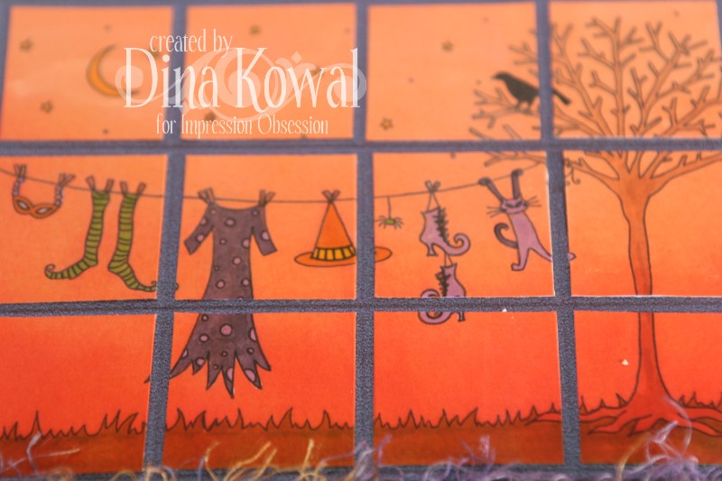 This next image is called Birds on Brooms. I used the Glaze pen on this one as well, but sponged color onto the background rather than dragging the inkpad across my card. The clouds are created using a mask which I made from a scalloped circle. I used the Swirls Cover-a-Card on the card base.
 I'm so glad it's finally Friday! What are your plans for the weekend?
Welcome to JustRite Stampers’ newest Wednesday feature, 12 Weeks of Christmas Blog Hops 8! Every Wednesday up until Thanksgiving some of your favorite designers will be joining some of the JustRite design team for a series of Christmas blog hops, showcasing JustRite’s entire Christmas Collection of stamps! This week, the designers joining the JustRite design team are the Flower Soft Design Team and The Shabby Tea Room challenge blog team! How fun is that?
I used the Backyard Birds set to create my Christmas card. When I trimmed out the cardinal image I noticed that the top branch image wasn't connected to the rest of the image, and could be used separately.... so I cut it off! I stamped the cardinal in Pesto dye ink on pearlescent cardstock, and masked the bird, branch and pine cone. Next, I traced a faint circle in pencil and began stamping the separate branch (stamping several times before reinking) around the circle, creating the wreath form. When my stamping was done, I used a circle template (Coluzzle) to create the round panel, then misted the piece with water so the Pesto ink would bleed and feather a little. I used a large stipple brush to even out the color. 
The cardinal was colored first with Neopiko alcohol markers and then shaded and highlighted with Prismacolor pencils. I trimmed along the underside of his wing and lifted it slightly with a craft knife for dimension. I used Polar White Flower Soft on the snowy branch and pine cone.
 Did you notice the gold borders along the edge of each layer? Those are called Peel-Offs, and they are also a Flower Soft product. They are really fun to work with, and the narrowness of these stickers them allows them to 'bend' around curves and such. They really add dimension and style to a project.
  Please visit these designers blogs to see what fabulous Christmas projects they have for you on the hop today! And mark your calendars for Wednesdays at 9am Central for great Christmas gift, card & project ideas, starting at the JustRite Inspiration blog! And don’t forget that JustRite has some Christmas stamps in their newly released CLING line of stamp sets -- you can find them HERE.
JustRite Design Team:
Sharon Harnist
Angela Barkhouse
Sankari Wegman
Stephanie Kraft
Kazan Clark
Michele Kovack
Kellie Fortin
Barb Schram
Debbie Olson
Becca Feeken
Heidi Blankenship
Flower Soft Design Team:
Jeanne Streiff
Debbie Seyer
Gini Cagle
Linda Beeson
Deb Felts
Cibele Glazer
Vicki Garrett
Dina Kowal **you're here!**
The Shabby Tea Room Design Team:
Debbie Marcinkiewicz
Nicole Segnere
Clare Buswell
Pattie Goldman
Lisa Golzbein
Cathy Clark-Sanite
Thanks for stopping by today! Today is my blog's 4th birthday, so this was a fun way to celebrate. Enjoy the hop!!
P.S. You'll notice in the photo above that I used the clear acrylic blocks for my stamping on this project, because I was working with single images, and also wanted to be able to see right where I was stamping the small branch. If you purchase the Backyard Birds set, you'll need the 3-1/4" round wooden block to be able to stamp the borders.
Thanks to those of you who have checked in on us after hearing our region mentioned several times on the news in the last few days! We are fine and far away from the disaster areas. We appreciate you thinking of us!
I keep challenging myself to improve my coloring... I tend not to leave lighter areas when I watercolor, so that was something I kept in mind when painting this image. This is one of the new unmounted House Mouse stamps available through Joanna Sheen. I watercolored using reinkers and Derwent pencils. The main color I used is a Vermillion ink by Impress - isn't that a fun color? So weird how my tastes are always changing.
 Here's a close-up on the background panel - it was made by inking the paper with the Vermillion ink pad, then layering Cover-a-Card stamps (Distressed Lines and Flourishes)
 I used narrow strips of paper to 'thread' my buttons too - less hassle than sewing them on, and the paper helps anchor the glue too.
 This week's challenge over at the JustRite Inspiration blog is to create a project that incorporates a recipe. I thought it would be fun to create a shaped recipe card holder that could double as a Christmas card... I have a single friend who works on another island and someone will be going her way in a few months - this will be perfect to tuck in a package. We try to send letters back and forth if someone is traveling there from here, but I've missed a few opportunities, so I want to make this package special.
All stamps are by JustRite Stampers - I used stamps from the Christmas Nested Frames set for the tag, and the roses from My Garden for the decoration on the mug. The tag is stamped and sponged with Brilliance Pearlescent Ivy ink, and colored with Prismacolor pencils and Neopiko markers. The roses are stamped in white dye ink and colored with a white Prismacolor pencil.
The mug template is my own design - you can grab it below (it should enlarge if you click it). Feel free to resize and use it as you like, but please give credit here for the design, and link others here to download it themselves, instead of posting the template elsewhere. You can line up the fold of your card at the top or the bottom of the mug - mine is folded at the bottom, and glued just around the edge to form a pocket.
I typed the recipe in another language, so I'll translate it here - this is my modified version of Russian Friendship Tea using ingredients that I can find here.
Christmas Tea
1 cup instant lemon tea
2 cups powdered orange drink
2 cups sugar
1 tsp. cinnamon
1 tsp. ground cloves
Combine all ingredients (you can even blend them for a finer powder); store in an airtight container. To serve, add 3 spoonfuls of the mix to a cup of hot water. Enjoy!
Thanks so much for stopping by!

 The fun thing I discovered when I was making this card is that the Sakura Glaze pen can be used for a resist technique. I colored the branch image with Prismacolor pencils, then covered the entire image with the Glaze pen and let it dry completely. After I did that, I could drag an ink pad over the image to color the background - it filled in perfectly, and didn't affect the glazed areas at all. On this sample I used Colorbox Fluid Chalk ink - other inks would probably work too - just have to experiment. If you like to use your brayer, that might be an option as well. My brayer is not my friend.
 Check out that branch - the leaves are sort of owl-y too.
 Have a great weekend!
 I wanted to compile the questions you asked regarding colored pencils and answer them in one place - here we go!

3. Should I purchase individual pencils or should I buy a pack?
If you're happy with the colors in the sets that are prepackaged, you will save a few cents per pencil by purchasing sets. I prefer buying open stock so I have options and can fill in where I feel my collection is lacking. Dick Blick has graduated pricing on many of their open stock pencils, where the more you buy the lower your price is. If you're having things shipped or carried overseas, the pencil tins will add to the weight of your package, so that's another consideration.
4. Have you used the colorless blender pencil instead of OMS?
I have. It works well, with a little practice. The technique is a little different than working with OMS. Here is a wonderful article on the colorless blender pencil by Jennifer Ellefson - why reinvent the wheel? Her explanation and visuals are beautifully done.5. Some of Prismacolor pencils (which are made in the USA and are about a year old) will NOT blend with OMS - specifically 2 of the reds and several of the blues and greys - the rest of the colours work beautifully - so I wonder if there is some difference with different Odourless Mineral Spirits (?). I don't use Gamsol - just Art Spectrum brand - thought they were all the same thing (?).
I use a generic OMS that I picked up in the paint section at Walmart a few years ago. It works for me. I'm sure the finer brands of artist quality are higher performers and more odorless... but I'm unable to find anything odorless where I am so I needed something that came in a lightweight but large bottle to last a few years. I'd say if you're using an artist grade OMS, the problem isn't with the OMS.6. If I use baby oil as a solvent for blending, will it stain the paper?
It can, if you're not careful. It does take a little practice in getting the right amout of baby oil on your stump, and blending from the center of the image out to the edges. The results are similar to OMS blending, because the concept is similar - breaking down the pigments of the pencil with a solvent. Baby oil smells better, but I prefer OMS and find it easier to work with in adding layers of colors after blending.7. Do I really need those many shades of grey that are there?
Probably not. I don't use mine super often, but when I do I tend to use the French Greys most because they are more warm and slightly brown.8. Would it a be a big task to the list the must haves?
Again, it's a matter of personal preference. Others may use brighter or more primary colors than I do, but these are my go-to pencils in general.
I tend towards warmer versions of cool colors too... not many cool greens, blues, or purples! Lots of browns, warm colors, and earthy neutrals. A rule of thumb might be to choose a general mid-range of colors that you love (red, orange, yellow, green, blue, purple, brown, white, and black - in a primary, bright, or muted version), then find a lighter tint and darker shade suitable to each color. If you like bright primary colors, start with those; if you're like me and prefer a more muted range, start there. Here's an example of what I mean:
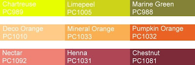
For those that are wanting to avoid the Mexico Prismacolor pencils, here is a visual of the difference between old and new product. The printing on the old pencils is gold foil stamped, and the printing on the new ones is foil stamped in silver (except for the white pencil, which is printed in black - that one is shown below because it's easy to read and I had both whites unsharpened). There is a colorless stamp toward the end of the pencil that you would sharpen that indicates the place where it was manufactured.
 OK! That hopefully answers all the questions so far!
Impression Obsession has some great quote and sentiment stamps - the Design Team is showing some of them off today! Here's my card: The quote stamp is called "Change the World" - one of my favorite quotes, and I love how the text art highlights those specific words. I stamped the Roses first, then used a stamp positioner to snug the sentiment in between the leaves. To cut out the label, I referred to this tutorial.
 The roses are stamped in Colorbox Fluid Chalk Dark Brown ink and colored with Prismacolor pencils - I stamped the image a second time and colored just the center of the rose, which I cut out, shaped, and glued in place. On the background panel, I stamped the Rose Cover-a-Card in Dark Brown and highlighted with a Beige pencil. The edges are scored, sanded, and lightly brushed with a gold ink pad.
 Prismacolor pencils that I used:
 Remember you can enter these challenges too, using your Impression Obsession stamps! See the I.O. blog for all the details - you might even win a $25 gift certificate!! We'd love to have you join us. Be sure to check out the other designers' blogs for inspiration - their links are to the left!
This week's Flower Soft Sprinkle challenge over at SCS (FSC08) is to use Flower Soft on your project with the theme, "Heavy Metal". We'd love to have you join us, wherever that theme takes your imagination......
I was hoping to have my Gold and Silver Flower Soft to play with by now, but it is still somewhere between there and here... so I had to let my imagination flow. Sleep deprivation is not my friend, and some other life factors have me thinking with very little clarity this week... so the best I have come up with so far is a card with a heavy, metal object on it.
It's a wheel barrow.
Don't even ask me how I came up with this card or color scheme when the challenge theme immediately had 'Born to Be Wild' blaring in my head. NOT that I'm unhappy with the card... but it's going to look a bit funny, I think, with the other entries.
Just. Saying.
Behold.

The heavy metal wheelbarrow is watercolored using Derwent pencils and a water brush. I used a Coluzzle tag template to cut out the oval. I used a mixture of Flower Soft colors again - starting with Ultrafine Sage, then layering Baby Pink, Autumn Mix (just a touch), and Russet Red.
 Oh! BTW, the image is Flower Wheelbarrow, from Impression Obsession. In case you want to make a heavy metal card too. HA!
Thanks for your comments on the colored pencil posts - I'll compile questions and answer them over the weekend. Cheers!
Here's an updated version of my pencil comparisons... I've added a few more brands and put them all together in one chart. I was thinking I had a red in every line in my collection, which was true.... until I got down to the Pablos. Ha! Anyway, take a look - the swatch to the left is pure pencil, while the right swatch of each pencil is blended with odorless mineral spirits (the exceptions are the Inktense pencil, blended with water, and the Graphitint, blended with mineral spirits to the left of the swatch and water on the right. I was working on text weight paper, so the water blending didn't go so well, but it gives you an idea, anyway). Thoughts:
1. There has been talk about a drop in quality (specifically in blendability) since Prismacolor production moved to Mexico. I honestly didn't notice a difference. Prismacolor remains my 'go-to' favorite, though it's fun to fill in colors where their line is lacking!
2. IF money were no object... of the pencils above I would love to have more of the Pablos. So many great colors, and they blend so richly... sigh...
3. I still find the Derwent Studio pencils to be the poorest blenders. By the way, I learned that the Studio line and the Artist line have the same color cores, but the Artist pencils have a bigger diameter. I don't dislike these pencils, though, actually. I've been doing more pencil work without blending with mineral spirits, and the firm lead on these is nice for that technique.
4. I got a set of 24 Coloursoft pencils - they are very soft and blendable - nice pencils. I find the lead a little crumbly, but not overly so. Good value for the price.
5. The Creative Mark line (Raffine) is new to me, and I thought I'd try out a small set because the price was right. They covered well and blended fine, but lost some color in the blending. However, adding layers of color is always an option, so if you're looking for an inexpensive pencil, they're not a bad option. You can read an excellent review on the pencils at Rob's Art Supply Reviews.
6. As far as the best value for price, the Blick line is limited in its color range but the pencils are brilliant and also blend well.
Just to decompress yesterday, I sat down with this bicycle stamp from Flower Soft - this is a huge and gorgeous image (sort of ironic that it took me half an hour to find it...)! I've been challenging myself to use my pencils differently - using a lighter hand, layering colors, letting the pencils blend themselves instead of using a solvent... so this is one of 'those' cards. Turns out the cardstock I can get here, which surely isn't anything special, has a decent tooth on it for this kind of pencil work. Fun stuff.
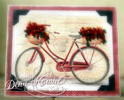 I also wanted to color something RED and play with layering different colors of Flower Soft - I pulled the Flower Soft out first to determine my color palette, and went from there. These are the pencils that I used, plus a tawny brown from my watercolor pencils that matched better with the Toffee:
 When you layer colors of Flower Soft you do have to think ahead... I started with the Christmas Green - not my typical green but I love the dark boldness of it here. Next I put in some Ultrafine Toffee (sort of in the background). Next I added the Autumn Mix followed by Russet Red. So far I've liked the Autumn Mix on everyone's cards but my own, but I love the subtle combination here with the deeper red. While my glue was still a little tacky I sprinkled Ultrafine Strawberry over both areas. After everything dried, I added a little more Autumn Mix in a few spots. It was really fun to experiment and mix - don't be afraid to do that!
 If you have questions please feel free to ask! Enjoy your weekend....