Friday, April 30, 2010

Sneak Peek!

Just wanted to share that I have a new set being released in May by Our Daily Bread designs - the set is called "As You Graduate," and features a collaged image which is a combination of several photos I love. The image conveys a sense of hope, new beginnings and new possibilities, which is what I wanted to capture in a set that could be used for a graduation card, or for someone going into a new ministry, new home, college, etc. Here is the set, which will be available for purchase May 1st: Something else I wanted to share about this image is that it was designed in such a way that it can be used in its full size, or can be cut to fit into several different orientations. Cut vertically, there are 2 different options for bookmarks. Cut horizontally, there are 2 panels that can be used. The butterflies can be cut out and 'popped' separately, or just trim around the edges of the wings, and raise them up a little. The bird could be the focus of an inchie. The trees could be left bare, or filled in with a texture stamp. Lots of possibilities! I'm sure you can think of more, and I'm sure more ideas will come when I have my own set in hand. For now - enjoy the preview, and check out the sneak peeks from design team members! Their links are all on the ODBD blog. Thanks so much for stopping by!

Wednesday, April 28, 2010

Be Still

Here is another card using a set from my most recent DKdesigns release at smARTworks. This set has become a part of the Wistful Thinking full sheet - lots of good stuff on there!

The focal panel is a piece of watercolor paper I had played with for another project which involved misting the paper and mixing Twinkling H20s - it's pretty girly and shiny, which doesn't show well in the pictures... but anyway, it made a great background for this photo stamp. I trimmed the background into a square and rounded the corners. Using a Coluzzle nested square template, I cut out the inner rounded square as well.
My card is a gatefold card, 4-1/4" square. If you can picture the focal panel flipped over, there is double stick tape on the left half of the inside square (the ribbon is also attached with that tape), and double stick tape on the right half of the outer square.

The view below might make a little more sense than me trying to explain things...the ribbon comes up over the outer frame on the left, and that sort of 'locks' the card shut, in addition to the tie on the right.

This is a view of the inside of the card. The verse fits nicely in the corner of the inner panel, and is also designed to snug up next to the main image. I used the extension of the flourishes on the main image to embellish the corner, as well as the edges of the card front.
This fits with the Papertake Weekly Challenge to "do something different" - don't think I've ever made one of these cards before! Also, at Clearly Inspired Challenges sponsored by Clear Dollar Stamps the challenge is to "tie it up" with ribbon.

Be still - good message for me this week!
Thanks so much for stopping by!

Monday, April 26, 2010

the journey

Here are a couple quick cards made with some DKdesigns stamps available from smARTworks... BTW, yesterday I spent some time updating my Design Resume page... not sure why I have done that, but for what it's worth - it's there! Must be my personal need to organize trivial things. Quirky I am. :)

I actually used 2 different sets on these cards. One set is called Journey, and the other Path set has been combined with a few of my other sets as part of the Wistful Thinking full sheet. I designed them as one set originally, and I love how they work together. This was a simple card to make - the path was colored in with a Neopiko marker, and shaded here and there with a single Prismacolor pencil. I stamped in the grass with a small grass stamp from another set. The grey panel is embossed with a Fiskars texture plate, and I used my Scor-Pal to score the diagonal lines on the card base. As I'm looking at it now, I think the little buckle on the ribbon must have come from an old bra. Do you think? hee hee..... Another quick card here - the path was stamped in Wheat chalk ink (Versamagic), and the girl from the Journey set was stamped over the top in Memento Tuxedo Black. I used a Neopiko marker to just lightly color in her top. I used some aged writing paper as my card base, and the bottom scalloped piece is a map-print vellum.

I have my work cut out for me today... the bride-to-be is coming over to help with the invitations tonight so I have 104 eyelets to set before then. Invitations are printed and scored to fold, and the vellum layer is trimmed and punched. Sorta thankful to be able to use up so many eyelets in one pop... eyelets were one of those things I bought hundreds of in every color so I would never run out... sigh...

Thanks so much for stopping by!

Saturday, April 24, 2010

Clean corners

Yesterday was a work day at our house - one of our classes is doing a fundraiser, so we thought we'd help them out and at the same time, attack some projects that have been on our to-do list for at least a year, and do some deep cleaning to our floors and into grimy corners. It was a fun day...but a long day! We worked along with the students, and really accomplished quite a lot - floors are cleaned and waxed, kitchen shelves all wiped down, my freezer is finally defrosted and cleaned (it was really gross...), and a few other carpentry projects are underway - a repurposed novelty table, workbench in the shed, screen door for the back, shelves for the boys' room.

So my clean corners made me think of this card - this was one of my CHA cards using a Gary Robertson stamp from Impression Obsession's Spring release. (The image is called Sunflower with Butterflies.) I thought I'd experiment with coloring just the foreground image. Gary's artwork is so detailed - I liked being able to highlight just one area with color, and and leave the background in the background. I let my coloring 'do the talking' on this card, and combined textures to break up the white-on-white panels a little. My coloring was done with Neopiko markers, highlighted with a white Prismacolor pencil (Neopiko markers are an inexpensive non-refillable alcohol marker - I got mine at http://www.oozak.com/ during a closeout sale).

All for now - I am taking a 'me' week this week, and the kids are finally having their Spring break. I'll be ordering homeschool stuff for next year, working on some publication calls, finishing up those wedding invitations, and starting on some details for our upcoming graduation... and one day I will learn how to actually rest during a break...................!

Thanks so much for stopping by!

Wednesday, April 21, 2010

Just Be..........

Solid stamps are fun to work with and very versatile. One of my favorite techniques with solid stamps is a 'faux watercolor' technique, where the stamp is colored directly using chalk inks, water-soluble markers or dye inks, watercolor crayons, etc., then misted before stamping. An alternative to misting the stamp is misting the paper, if the paper being used is heavy enough to withstand the extra moisture (for example, heavy cardstocks (110# and up) or watercolor paper).

For this card I used watercolor paper, and Versamagic Chalk Inks... I inked the solid images first, then misted the stamps with a small spray bottle before stamping to the paper. Stamps I used:

Solid Tree
Solid Tree Leaves Trio
Cottage Fence (upside down)
Riding Pretty clear set (Christmas tree image - as grass)
Life and Flowers clear set (sentiment)

The background and edges were sponged with ink, and the sentiment panel is 'popped' with dimensional foam tape. I scored the edges with my Scor-Pal and sanded the raised lines lightly. I love the little pop of blue in the background...it wasn't intentional, actually - my stamp just wasn't very clean! But it works...and makes me want to take a morning walk in a foggy park.

I am feeling the "Just BE" of this card... one more class day to go, but it will just be talking about resources that are available, collecting evaluation forms, and handing out a test, so in a way I feel "done". Next week we'll finally get to take our Spring Break, and I have a list of projects to finish, many of which involve STAMPING. Looking forward to that!

Thanks so much for stopping by!

Spring Things

Busy days and weeks make me long for a quiet hour or two, and a chance to unwind by coloring at my stamping desk. I've been waiting to work with this beautiful line-art stamp from CowTown Stamps... Laurel frequently updates her Dollar Sale page (overstocked stamps - there are over 500 designs in there right now~!) , and since I found a few 'needs' in there, I thought I'd look around for a few other images as well, you know... to justify the postage. Heh heh...


This stamp image is called "Spring Stuff" - I chose a buttercream cardstock to stamp it on, then colored it in with Prismacolor pencils, blending with odorless mineral spirits. The colors I used are charted below. I like the idea of coloring on a colored or patterned cardstock - I'll have to play with that some more. Hopefully next week I'll have some time to 'find myself' again...! Here's some more of my Mom's stash of trim, and a tiny scrap of grosgrain ribbon from my ribbon jar. I cut the scalloped edge with decorative scissors (gasp!).

I'm halfway through my week - DH has been helping with the health class these last few days, since he has lots of first aid and first response training. That's been good. Glad to have him help me, as my first response is normally to freeze and cry...!

Speaking of DH, we got encouraging news yesterday, and a plan to move forward with his language study in preparation for team-teaching in the Fall. Teaching is his love and his heart, and he had been asked to step out of the classroom for some time to improve his language, so it's exciting to see that the plan is in place for him to begin teaching again next semester. I'm so proud of him!!!!
Thanks so much for stopping by!
P.S. On the pencil codes below - PC are Prismacolor, LF are also Prismacolor but their Lightfast line. Pablo is a line put out by Caran d'Ache.

Monday, April 19, 2010

Refreshing

This is my entry for this month's smART-word Challenge - this month's word is FRESH. Soooooo many ways that word could go... my first thoughts revolved around fresh fruits and vegetables (for that one I was thinking of using inks that were named after foods), but then I started thinking - what about a fresh perspective? The last few months have been busy ones, and on top of that, there have been disappointments and opportunities for hurt feelings. I looked through my catalog of sentiments and this one from smARTworks' Cookie Plate jumped out at me. I know that in my life the only way a fresh perspective comes is through setting aside all that is cluttering my mind, and turning my attention to the Lord. So that's what this card is about!

The other stamp I used is from a smARTbucks-only set called Vintage Variety - it's a large branch image with a bird on it. Love that one! My background was created by swiping some chalk inks directly onto watercolor paper, then spritzing to make the inks run. After that was dry, I sanded the piece a little, then stamped the branch image and sentiment. I filled in the florals with white gel pen, and kept the rest of the card clean and simple with textures on white. That bit of trim is from my Mom's stash, which I remember admiring as a child - guess I've always had a fascination with buttons and trim. Thanks Mom!

There's still time to enter this month's 'Fresh' challenge, and you can view all the details and rules at the smARTword site. You'll see my card posted over there soon, along with a few others by present and former team members.
Thanks so much for stopping by!

Friday, April 16, 2010

It's time.............

Time to share the final smARTworks design team challenge, using these watch part stamps from the Time at Hand stamp collection. I made a black/ white ATC with my stamps - the watch is stamped on platinum vellum, and colored from the back with Neopiko marker. The watch face is underneath the vellum; also backing the vellum is DP full of numbers. I used the clock face, stamped 3 times overlapping, to create a large scalloped border for the edge of the card. The hands of the watch do actually turn, for what it's worth! Sort of an expression of how time has just been flying lately....!

For those not familiar with an ATC, it is an Artist Trading Card, the size of a baseball card (2-1/2" x 3-1/2"), made for the purpose of trading with other ATC artists.

As usual, take a hop over to Susan's blog for a chance to win your own set!

It's also time to officially part ways as a design team, as was announced last month... So long, farewell, friends... it has been an enjoyable ride together! I wonder what's next?
Thanks so much for stopping by!
P.S. I found another challenge to add! Stamp Something's challenge is to incorporate layers.

Thursday, April 15, 2010

Impression Obsession DT Challenge: High school colors


Yaaaaaaay BLUE! Yaaaaaaaaaay WHITE! Yaaaaaaaaaay DRILLERS! FIGHT FIGHT FIGHT!!!

The Impression Obsession design team has challenged each other - and you - to make a card using your high school colors. Yep, I'm a Driller...."once a Driller, always a Driller," they say......

To be quite honest, Driller Blue is probably the color I use the least, so as a challenge, this one didn't come easy. I had decided on a nautical scene, and this was one in my collection - this is a section of Seaside Scene, which I stamped with Brilliance Mediterannean Blue Ink.... Not even sure how that inkpad got into my stash, or if I have ever actually used it before! I used watercolor paper and a single color of Twinkling H2Os to fill in the scene. The sentiment is called.... Thinking of You.

I wanted to combine this with another challenge, and completely coincidentally.... Ready-Steady-Stamp had this recipe challenge:
1. Sea
2. Blue, White/Cream, Brown & Black
3. Seashells
4. Oval
5. Sand

Heh heh....got all 5! I'd found these teeny shells for sale in town and the sand - local embellishment type stuff - and they fit in the depth of the oval Shake-It pouch. I grabbed a smattering of designer paper... LOL - yes, I still have 'that paper'!! If I'd had more stamping time this week I would have made matching DP with my Cover-a-Card stamps, but alas.....it was not to be.

Did you know that you can enter these challenges too, using your Impression Obsession stamps? See the I.O. blog for all the details - you might even win a $25 gift certificate!! Be sure to check out the rest of the team's cards for inspiration....links are over to the left!
Thanks so much for stopping by!

Tuesday, April 13, 2010

blaaaaahhh......

Wish I had something more to share... sigh... this has been pretty much a no-stamping week, though I did get a challenge card done and got in a little coloring yesterday just for fun. I was up all night with a stomach 'thang'... not sure what to make of that, but I'm taking it easy today. I was thankful to find out that 'whatever it was' didn't affect any of the dinner guests we had last night - that would be embarrassing! - but...I was sad to miss my class today.

Here's a sneak peek at my card for tomorrow's Impression Obsession challenge, just for fun... then I'm gonna get this warm laptop off my lap - that's sure not helping anything!


Thanks so much for stopping by!

Sunday, April 11, 2010

Bubbles and baubles

 Here's another card with my Bubbles set from smARTworks...... this is a super simple layout, and a fun way to use up coordinating scraps. The only coloring on the focal image is a little Ivory Oxide colored pencil over the buttons. The image is stamped in Vintage Sepia ink. I stamped some bubbles on the dark brown background strip to pull the theme of the card together.

BTW, the set comes with a coordinating sentiment, "Thank you so much!" which could easily be used as an inside-the-card sentiment or stand alone.

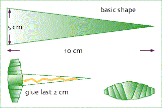
My card is 4-1/4" x 6" (standard-sized paper here is A4). I folded it first, then scored an inch from the fold, added 2 eyelets and tied the closure with some hemp. Just for fun, I made some paper beads from the same blue paper you see at the top of my card.

Here's a picture I found that shows the basic concept of making paper beads - they are quick and easy to make yourself, and perfect as a matching accent. I wrap mine around a bamboo skewer, starting at the wide end, and making sure to keep the point of my triangle always somewhat centered. When I get to the last little bit, I put a dot of Crystal Lacquer on the bead and move it around the with the tail end so it sticks down the point and gives the bead a clear coat to seal it.

That's my quick eco-friendly card for the day!

Saturday, April 10, 2010

Bubble Bath

More bubbles....!

I took some inspiration from Mel's bathtub card post for this card - love all the detail she puts into her art! I sewed some clear seed beads on first, here and there, then added more bubbles using Crystal Lacquer and microbeads (teeny, tiny hole-less beads) - they sort of 'clumped' (aaahhh!!) so I moved them around with a toothpick until I got them where I wanted them, then let them dry over night.

I used Crystal Lacquer to make some water spill over the side of the tub and onto the floor. The image was painted first using reinkers mixed with Shimmerz.

What else did I do here... the bow was made with a Bow-Easy - I threaded the ribbon through the button holes. All the stamps I used are from Heartfelt Creations. If you like bears, they have a bunch of cute scenes to choose from... you can see them all here! The one I used is called "Bubble Bath".

Here's a closer look at the bubbles - sort of hard to see still, but hopefully you get the idea.

Thanks so much for stopping by!


Friday, April 09, 2010

Whew............

I think I survived this week....!


Here are a couple of things that kept me busy, not to mention teaching our missions students every morning, and a completely lost day sitting with DH at the mechanic in town...

Easter afternoon my little guy fell out of a tree and banged his eye - this is a picture from day 2 - he could barely open it for the swelling, poor thing! It is healing really well though now. He had his 4th birthday Thursday, and he says, "I'm 4 - now I can drive!" Stinker.

I worked this week to to make a prototype wedding invitation for some of our students who plan to marry here on campus at the end of May. Had to test out my ideas, so there are 2 models there - one with the photo printed on the vellum and one with the photo underneath. Still changes to make before I start mass-production - they want the photo underneath (sigh...I liked the other one better...), a few more words on the vellum, and the photo flipped so the guy is on the left. The card is a gatefold, and will close with an oval panel on the front (you can see it in the background), tied with a sheer white bow.
Not sure that today holds much rest either, but we'll see. Thanks so much for checking in on me!

Thanks so much for stopping by!

Wednesday, April 07, 2010

Blew it.............

I think this card ranks among my favorites ever - this set is from smARTworks' last release, and is one of my own designs. Here is a direct link to the catalog page... I love how the artwork turned out, and the font is a fun one too... the sentiments can go together or stand on their own. (There is another set of sentiments that say, "You blew me away with your kindness..." and "Thank you so much!") I colored with Prismacolor pencils, and the colors I used are down below for your reference. I added a few extra dew drop 'bubbles', plus some smaller Crystal Lacquer ones. The large bubble is covered with Crystal Lacquer, with some white acrylic paint swirled in.
I made this card an easel card, so here you can see what it looks like propped open. The layering inside is enough to hold it - no button or other prop in mine. Isn't she a darling? And the colors of this card make me want to go to an ice cream parlor.....just sayin'.

Here's a close up and better angle on the bubbles......
Thanks so much for stopping by!

Monday, April 05, 2010

Jasper

So much going on in this card!

First of all, this is my first card using one of Impression Obsession's stamps by new artist Gail Green of "Sweet Petatoes" fame - these stamps are fun and funky and super detailed, which makes them fun to color. I colored this guy, Jasper with Butterflies, with Prismacolor pencils, and as requested, below is a list of the pencils I used. Cool, huh? heh heh.... I used a white gel pen to add some highlights to the butterflies and on Jasper's little face.

For the background, I chose some coordinating inks and swiped them onto white cardstock, then layered 2 Cover-a-Card background stamps - Large Paisley and Medallion - over the top in varying shades of brown. I stamped Petal Flourish up the side, and sponged the edges, then drew in a light tool line around the edge of the panel with a fine-tipped brown marker. The cotton gingham ribbon was a local find.

I left my card sentiment-less on the front - I'm finding I need more cards that are left 'multi-purpose' for things that come up unexpectedly - this could go 'birthday' or 'thanks' or 'friendship' or 'encouragment' at a moment's notice.

Hope you had a blessed weekend - I totally vegged on Friday and got a lot done Saturday morning (despite my cough and puffed up eye) while DH took the kids to an Easter party (for a few hours, a clean and quiet house ... ahhh...). Sunday was church and potluck, then lesson plans for health class and homeschool... another busy week!

Thanks for stopping by!
Thanks so much for stopping by!


Thursday, April 01, 2010

Impression Obsession DT Challenge: Celebrating Mom

It's time for a new challenge from the Impression Obsession design team - in this challenge we're "celebrating Mom"!

I remembered our last challenge, where we made a card that would represent a "me day", and I thought about what my Mom might do on her "me day"... Mom loves the beauty of the outdoors, and adds to the beauty of it by gardening (click there to see some of Mom's spring bulbs that were blooming when we were at her house 2 years ago...gorgeous!). She loves butterflies too, and the testimony they are to how something beautiful can come from something common.

I thought this new image, Watering Can with Butterfly, from artist Gary Robertson would be perfect - watering cans, flowers and flower pots, with a butterfly in the center. I watercolored the image with Derwent watercolor pencils and a waterbrush (Niji), using some of Mom's favorite colors. After the piece was dry, I added some texture by cross-hatching with a Prismacolor Pencil (Espresso) in some of the shadowed areas, and added some highlights with a white gel pen. I also cut around the wings of the butterfly carefully, and bent them up, then covered them with some Crystal Lacquer. That little bit of dimension and shine adds so much! I sketched in a few blades of grass behind the scene to give it some depth.

I used the Cover-A-Card Wood Grain stamp for my background panel - I swiped some light blue and sand ink on the cardstock first, then stamped the woodgrain in a sage ink over the top. You can see it closer in the photo below.

Did you know that you can enter these challenges too, using your Impression Obsession stamps? See the I.O. blog for all the details - you might even win a $25 gift certificate!! Be sure to check out the rest of the team's cards for inspiration....links are over to the left!
Thanks so much for stopping by!
P.S. I found another challenge to link up to for this one - Spring cards at Everybody-Art-Challenge!