Wednesday, August 30, 2017

Splitcoast Tutorial: Stained Glass Stamping

It's my turn to share a tutorial over on Splitcoast - this week I'm sharing my technique for Stained Glass Stamping! Here's a sample I showed in the video -


By combining these two images, and then coloring in the resulting sections, I created a stained glass effect!
Morning Rose

Cover-a-Card Craquelure
The technique can be a little time consuming with a larger image like this, but I'll tell ya... using the Chameleon markers with the new Color Tops made it soooo much easier! More on those in the coming weeks - and you can see them in action in the tutorial video if you click over there. They are a lot of fun.


Hope your week is going well!
Thanks for stopping by!

Thursday, August 24, 2017

Impression Obsession DT Challenge: So Very Thankful

The Impression Obsession team's challenge today is to create a thank you or thanksgiving project.


Here's one of my board samples from the recent Fall/Winter release - the panel is Canva-Paper, watercolored with QoR paints. I love the texture of this paper, and the way the paint pools. So pretty!


Stamps I used: So Grateful, French Script, Perched Bird on a Branch
Dies: Mini Rectangle Tags 1 die set

Be sure to check out these other designers' blogs for inspiration -


Remember you can enter these challenges too, using your Impression Obsession stamps! See the I.O. blog for all the details - you might even win a $25 gift certificate!! We'd love to have you join us.
Thanks for stopping by!

Wednesday, August 23, 2017

Splitcoast Tutorial: Camouflage Background

This week's tutorial over on Splitcoast is a fun and easy Camouflage Background technique.


This is a great technique for a masculine card, and it's easily modified for military, hunting, or other themes. I used my Serene Scene clear set to create the focal image, matching the grey and blue inks (IO Hybrid and Distress Oxide inks) to my background. Here's a closer look at the background - there are several layers of ink, with texture added by crumpling the panel in different areas.


I did my stamping on a grey matboard ATC panel - this set is sized to fit perfectly on an ATC, and I love the soft greys and blues of this little scene. I also found it interesting that the Oxide ink resisted the IO Hybrid ink - I'll have to play with that some more later.


The embellishment is made with a couple of pieces of rustic floral wire, a little twine, and a charm I found on Etsy. Hope you like it! Come play along!

Thanks for stopping by!

Monday, August 21, 2017

Summer Silhouettes

 Just wanted to share a couple of summer cards, to hold onto a few more shreds of the season while I can... these silhouette images are so sweet, and so fun to pop into a scene of any kind.


Gail Green had a couple of beach grassy backgrounds that were perfect for a soft backdrop on these little scenes - I stamped them in light grey, and then watercolored in a loose beach scene around them. I love adding splatters - that was a perfect way to create a sandy texture here.


If you love silhouette images, and don't have a MISTI or other stamp positioner to help with multiple impressions, I'd suggest making that purchase in the future - it's a great way to get a really saturated image.


On this second card, I stamped the grass right side up and upside down to create a little reflection, then painted in a little sort of cove area.


I sanded this panel to get a little distressed look, and also added the sand and shells for more texture - I mixed them with matte gel medium so they'd stick together and stay in place on the card.


Stamps I used: Beach Girl, Marshland,  Leapfrog Silhouette, Sea Grass, Us Friends

Hope you have a good week - I've got my eclipse viewer ready, and I've also got to buckle down on some spring stamp artwork, as well as filming a tutorial and working on my next commission piece!

Thanks for stopping by!

Friday, August 18, 2017

Clancy and the cats

The commissioned pieces continue - I shipped this little Schnoodle off to his family in Montana this week... this is a mini 5"x7" portrait, which is a sweet little size.


My current project is this larger mixed media portrait of two kitties - you may recognize them if you follow Lydia on social media!


Still many layers to go, but it's coming together, and it's always exciting to see these precious animals come to life. You can follow my progress HERE and find out more about ordering your own piece HERE!

Cheers! Have a great weekend!
Thanks for stopping by!

Wednesday, August 16, 2017

Splitcoast Tutorial: Vertical Step Card

 This week's tutorial over on Splitcoast was one that had been requested several times - one of my authors needed a prompt, so I asked if she'd be willing to give it a try. Not only did she create a Vertical Step Card tutorial, she made it soooo easy!


Robin created a piercing template for the cut and score lines - I was surprised how quickly the base of this card was DONE! Hope you'll try it out. You could decorate every surface of the card, and I've seen them done with letters down the steps as well - I just wanted to use the step feature to add dimension to this little underwater scene. I made it using dies from Impression Obsession, and some backgrounds I had stacked up from an experiment that I abandoned.


Here are some better views of the pop-out feature of the card - it does fold flat for mailing in a regular A2 envelope, which is brilliant.


Impression Obsession stamps and dies I used: Fish Set, Mini Shell Set, Sea Plants, Beach Silhouettes clear set

If you're looking for something new, this is a fun one to try!
Thanks for stopping by!

Monday, August 14, 2017

Whimsy Stamps guest designer!

I have a few cards to share using images from Whimsy Stamps - look for a feature of their stamps every few months here! I just can't help myself.


I offered a peek at some of these cards the other day in my ink review, but I really wanted them to have their own glory day. This card was made using stamps from the Christmas Scene Builder set, but I wanted something that wasn't really holiday themed. Here's the set - so many possibilities!

I started this background by swiping ink across a piece of watercolor paper, then misting the panel and adding some kosher salt while it dried. The cityscape is stamped twice, but the first impression is grey and doesn't show very well. The moon is die cut and piece in (I added the watercoloring to cover a spot), and the stars are embossed with white detail powder.


This second card was also made with the same set - I have a handcut stencil that I used for the hill areas - I sponged the hills lightly and stamped the trees over the edge of the stencil, then misted each layer to activate the ink. 


I stamped some snow using white acrylic paint, just for a little more depth to the scene.


This second set is a brand new one from Whimsy - the artist isn't new to the team, but she's stepping out from the digital section with a couple of gorgeous clear sets. 


This one is called Summer Blooms, and it was such a fun pairing with my lifetime supply of Flower Soft.


I shared my technique the other day for the background - here's a closer look. I scored the lines first, then used grey, brown, and black ink to create a woodgrain effect.


By the way, if you love these images or love to color, and you're looking for a design team position, Whimsy has an open call for designers! You can find all the details HERE.

Thanks for visiting me today! 

Thanks for stopping by!

Friday, August 11, 2017

More commissioned portraits, people portraits, and ordering information!

Since the first dog portrait I posted, I've had more requests, and I'm having so much fun over here! Keep reading if you'd like me to commemorate someone special in your life. Here are 2 more dogs that I've had the privilege to draw (check my Instagram feed for progress shots!) - Here's Peanut, a sweet Jack Russell terrier...


And this is Molly, a Maltese mix...


And then on a whim between pets, I dug out an old picture of my son to see if I could do people, and well....


So I've set up a page with ordering information and some price estimates, and you'll find the link to that page below and also at the top of the left column here on my blog - if you're interested in commissioning artwork, please fill out the form you'll find at the bottom of the page, and you will be added to my waiting list. You'll be able to see your place and my progress there. Portraits make great gifts, so you may want get your name in early if you have a holiday gift in mind!


I'm learning so much, and I'm so grateful for the new direction and encouragement I've received - doing the portrait of my son reminded me just how special these keepsake portraits really are, and it's an honor for me to be able to preserve your memories in this way. Thanks for looking!
Thanks for stopping by!

Thursday, August 10, 2017

Impression Obsession DT Challenge: Orange and Turquoise

The Impression Obsession team's challenge today is to create a project using orange and turquoise as a color challenge.


I dug into my scrap stash for this card, piecing strips of orange paper together for the sky...

...and a sample piece from my Watercolor Imprints tutorial for the water at the bottom - that one is done with Distress Oxide inks.


Stamps and dies I used: Heron & Lake die, CAC Mosaic Tile, Serene Scene clear set

Be sure to check out these other designers' blogs for inspiration -

Anna @ Sassy & Sweet Notes
Chris @ Cat Tales and Paper Trails
Daniela @ For the First Time
Ilina @ Creativity Within
Jeanne @ Inky Paws
Jenny @ One Krafty Kat 
Karen @ Paper Lilies and Ink 
Kelli @ Stamping with a Dream 
Kittie @ Kittie Kraft
Laura @ Laura's Stamp Art Journal
Vicki @ Summerthyme Studio

Remember you can enter these challenges too, using your Impression Obsession stamps! See the I.O. blog for all the details - you might even win a $25 gift certificate!! We'd love to have you join us.
Thanks for stopping by!

Wednesday, August 09, 2017

Product Review: Clearsnap Premium Dye Ink mini pads!

 The Splitcoast Product Focus team has been working for weeks with these adorable mini Premium Dye ink pads from Clearsnap - we'd love for you to come over and see our reviews and samples! This is the color set available now - fun colors with lots of room to expand.


My favorite thing about these mini felt pads is the size - my hands are small, and these are so easy to hang on to!


Here's a peek at the inside - the size of the pad is perfect for quick swipes on a craft sheet or across watercolor paper for backgrounds and faux watercolor effects.


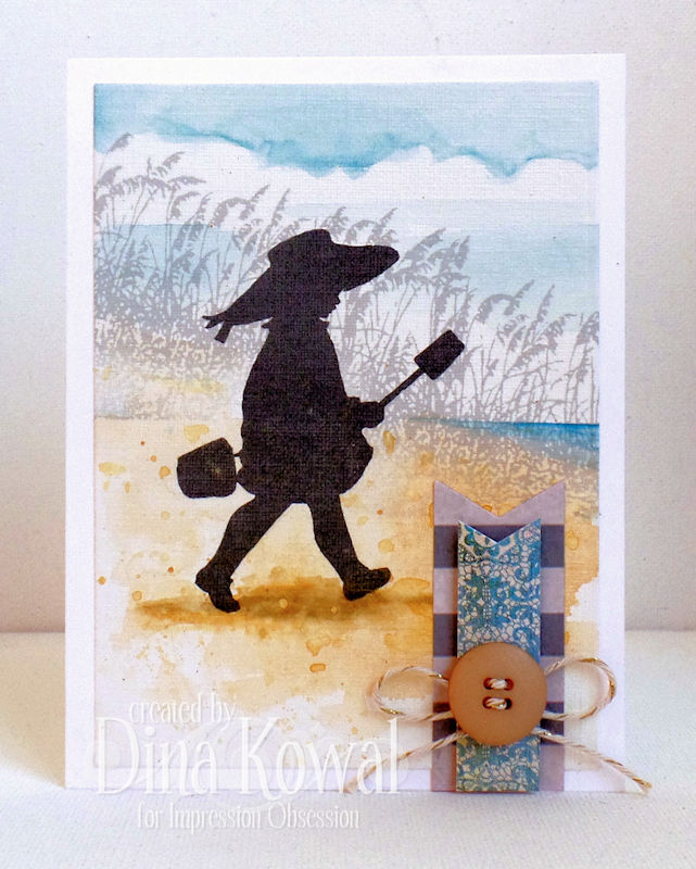
Here are some peeks at what I did with the inks - I'll share the full cards on another day so they get the stage. On the bicycle card I stamped in Mud Pie, then made a small palette with the ink on an acrylic block, and filled in a few of the details and splattered the background.


For the background panel, I scored some lines then swiped down the panel with Mud Pie, Fog and Coal inks for a faux wood grain. A little misting with water brought out some pink tones from the Mud Pie ink - so fun!


This background was done 'direct-to-paper' using Jelly, Fog, and Coal inks, then misted and sprinkled with kosher salt. The skyline was also stamped with Coal ink (several impressions using the MISTI).


For another background, I swiped Fog and Jelly inks on a craft sheet, and laid my watercolor paper into the misted ink for a softer background (this one was salted as well). I used a homemade stencil to sponge in the hills, stamped, and misted again to let the ink bleed just slightly.


Also - remember this card? The girls were stamped in Coal ink and colored with Copic markers - no bleeding!


These inks have all the properties you'd expect of a quality dye ink - water reactive, fast drying, vibrant color, crisp stamped images... in a tidy and cute little package!

Come read our review and see the samples the team has made - they're beautiful! And stay tuned for these cards in a guest post for Whimsy Stamps!

Thanks for stopping by!