Sunday, January 30, 2011

Showers of blessing!

Here's a little news for you........I get to add this little button to my sidebar as a member of this new, fun, and informal team!! I'll be sharing some Sweet 'n Sassy cuteness from time to time.

I've been practicing with my Touch Twin markers the last few weeks, trying to get the hang of blending and techniques... it's fun to learn a new coloring medium! I've been playing mostly with digital stamps, and recently added some more SNSS digis from to my collection - this is from a set called Let It Rain - there are soooooo many things I love about this set! By the way, it's also available as a clear set now!

I had a little fun with the blender pen on the puddle, and added some dimension with Crystal Lacquer. Love those bare toes! By the way, it has been raining almost nonstop here for the last few days... so this stamp seems incredibly apropos...... now to focus on the blessings instead of all the puddles!!
Thanks so much for stopping by!

Saturday, January 29, 2011

Thanks everyone!

Looks like our Impression Obsession Sneak Peek Hop Week was a success. Thanks to all of you who visited, and those who took the time to leave comments on all our blogs. Keep an eye on the IO blog for the announcement of our winner!

The new stamps are now available on the Impression Obsession site - links are below!

New rubber stamps

New clear stamp sets

If you'd like to see the cards I made with the new releases, I have posted them all in my Splitcoast gallery... I'll eventually post them all here with more details.

Some fun stuff planned for the blog this week... an announcement, a new release hop, and a Spring challenge - hope you'll stop by again soon!

Thanks so much for stopping by!

Impression Obsession CHA sneak peek!

One last sneak peek for this week - have you enjoyed the previews?! It has been so fun to read your comments throughout the week! Here are two cards with the same stamp but very different looks. I chose just 2 seasons to set the Church in, but it would make a beautiful summer or winter scene as well. Don't know about you, but I think that bare tree just begs to be played with......!! I colored this first image lightly with Prismacolor pencils. The bow was tied with my Bow-Easy and heated lightly with a heat tool. I used Sweet Pea Flower Soft on the tree.For the second card, I swiped the focal panel with Antique Linen distress ink, then stamped the image and highlighted and shaded it with Prismacolor pencils. I used Autumn Mix Flower Soft on the tree and also added Ultrafine Earth Flower Soft on the ground. The embossed cardstock on the card is actually reversed - I liked the back side of it better!

Other team members are sharing their sneak peeks today to finish out the week of previews - check out the I.O. blog for the lineup, and remember to comment on every post linked from the I.O. blog for a chance to win a $25 gift certificate! The winner will be announced Sunday. Good luck to you!
Thanks so much for stopping by!

Friday, January 28, 2011

Impression Obsession CHA sneak peek!

This card uses my absolute favorites from this new release!! The Cabbage Roses are so fun to color - this was actually one of my 'practice' pieces for my new Touch Twin markers. And of course, I love any images of cute things in tea cups! For the background panel, I inked up Cover-a-Card Damask (my other new favorite) with Vermillion ink, then spritzed the stamp with 90% alcohol before stamping to glossy cardstock, and sponged with tissue until dry. I tied two colors of ribbon together with my Bow-Easy, and heated the bow lightly with my heat tool.

Other team members are sharing their sneak peeks today and throughout the week - check out the I.O. blog for the lineup, and remember to comment on the team's posts throughout the week for a chance to win a $25 gift certificate!

Thanks so much for stopping by!

Wednesday, January 26, 2011

Impression Obsession CHA sneak peek!

A few more sneaks today, sharing some of Alesa Baker's new designs! (She has some gorgeous new Spring images too, but I'll save them for our Spring challenge next week.) This first card is really large, and different for me, but I loved making it, and this image is so unique. I love the sketched style - hope to see more like this in the future... ahem... Alesa... if you're reading my blog... I stamped the image (called Jil) on white cardstock then again on printed cardstock - this is my own creation, but if anyone would like a copy, I can post it. I used text from the Secret Garden, which I'm reading to my daughter right now - I have always loved that book! I cut the dresses out and layered lace in the openings, then pieced the dresses on the image on the oval panel. All the coloring is done with Prismacolor pencils. The dresses are shaded in silver.

The background panel is stamped with Cover-a-Card Wavy Lines, using Brilliance Pearlescent Ice Blue and Platinum Planet inks. I tied the bow with my Bow-Easy.

This second card uses a few new images: Reasons to Love, Wavy Line Heart, & Lovely Rose. I stamped the heart on the printed text paper, cut it out, and sponged the edges with chalk ink. The rose was shaped slightly by pressing it into the palm of my hand.The patterned panel was stamped with Cover-a-Card Roses then sponged around the edge.

Other team members are sharing their sneak peeks today and throughout the week - check out the I.O. blog for the lineup, and remember to comment on the team's posts throughout the week for a chance to win a $25 gift certificate!
Thanks so much for stopping by!

Monday, January 24, 2011

Impression Obsession CHA sneak peek!

This week (January 24 - 29) is Impression Obsession's CHA Winter preview of NEW IMAGES! Each day, different team members will be showcasing new designs. You could win a $25 gift certificate to spend on your favorite new stamps......! To be eligible to win:

...you must leave a comment...
...on every team member's sneak peek blog post...
...and the I.O. blog...
...every day...
...all week!

Visit the I.O. blog each morning for links to the posts for the day.

I'm starting off the sneak peeks today with my favorite new stamp designs from Gary Richardson! He explored a castle theme this time, and included this beautiful Sand Castle.
I colored the image with colored pencils, then added some dimensional detail by debossing certain areas with a large stylus on a foam pad. To create some texture and dimension at the bottom of the image I added Ultrafine Flower Soft (Sand and Toffee), mixed with sand and small shells (purchased locally). The coconut shell button and grass mat are also local products.
To create the background I stamped CAC Newsprint in Amber Clay chalk ink, Large Dots in Aegean Blue chalk ink, and the Damask stamp (from CL167 Family Sentiments) in Antique Linen distress ink. The sentiment is called Relax & Enjoy.
My second card was super simple - I stamped the Ocracoke Lighthouse on white cardstock, swiped the image with Antique Linen distress ink, then added a few highlights with a white pencil. The background cardstock (DCWV) was already textured. I stamped it with Cover-a-Card Script, then layered each panel on black cardstock.
The knot was the only tricky part - I followed a diagram online to make sure I went over and under in the right places.

Other team members are sharing their sneak peeks today and throughout the week - check out the I.O. blog for the lineup....... remember to leave comments for a chance to win!
Thanks so much for stopping by!

Friday, January 21, 2011

Flower Fairies

I made these 2 cards for my etsy store - the main images are from Stamp N Plus Scrap N - aren't they sweet? I'd been looking for some fairy stamps that fit my style, and finally found them here. The images are watercolored with reinkers and Derwent watercolor pencils... patterned paper is stamped with soon-to-be-released Cover-a-Card stamps from Impression Obsession, and the "happy thoughts" sentiment is from Heart & Soul Rubber Stamp Co.

Enjoy your weekend!
Thanks so much for stopping by!

Thursday, January 20, 2011

Impression Obsession DT Challenge: Purple

This week the I.O. team has a color challenge, so get ready for some purple cards! Keep an eye out for new images too! Also, beginning Monday and all through next week there will be sneak peeks on different designers' blogs. There are so many new designs! You can check in at the I.O. blog for links each day.

I have two cards to share for today's challenge... one watercolored card and one clean, quick and simple card.
This Elegant Tulip image isn't a new release, but it's new to me! I watercolored the image with Derwent watercolor pencils and a waterbrush. It was a fun one to paint - this is a Parrot Tulip, and there are so many different varieties!
For the background, I stamped Cover-a-Card Damask on the upper panel, and Canvas and Reverse Damask on the lower panel all with Brilliance Pearlescent Purple ink. These are my favorite new CAC designs and they will be available after CHA! The border is stamped with the same ink - that is from the clear set called Ornate Borders. I swiped the white organza ribbon with the same ink I stamped the backgrounds with - not sure why the shade looks so different! The ribbon is stamped with Flourish 1, and heated lightly with a heat gun.

My second card came together so quickly! The patterned panel is stamped with Cover-a-Card Screen and then with Round Floral (that ink is black, but it looks slightly brown in the picture because of the pearlescent cardstock... drove me crazy trying to get a decent picture!). I used a ruler to make a narrow border around the panel with an alcohol marker, then scored the edge with my Score-Pal. The sentiment is another new one from Alesa Baker. The gingham ribbon is some I bought a large roll of here. I tucked a folded flower under its edge.
Be sure to check out these other designers' blogs for inspiration -
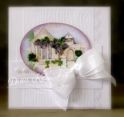
Daniela @ For the First Time
Deborah @ Cards and Things
Jeanne @ Inky Paws
Jenny @ One Krafty Kat
Julie @ Out to Impress
Kathy @ Watermelon Sugar
Kelli @ I Made This Myself!
Laura @ Laura's Stamp Art Journal
Shirley @ Card Art, Etc.

Remember you can enter these challenges too, using your Impression Obsession stamps! See the I.O. blog for all the details - you might even win a $25 gift certificate!! We'd love to have you join us.

Thanks so much for stopping by!
P.S. I'm linking this up to Make it Colorful, too - their 3rd challenge is to color an image in monochrome fashion.

Wednesday, January 19, 2011

Flower Soft Blog Hop: Anything Goes!

The Flower Soft team is hopping today... today we're sharing projects of any theme, using Flower Soft. You may see some new products along the way as well! If you arrived here from Deb's blog, you're on the right track. If you just happened to stop by, you may want to start from the Flower Soft Blog to make sure you don't miss a thing... because prizes are involved!!

The new products haven't made their way to my corner of the world yet, so I'm sharing a card I made with the Country Village Download - I deepened some of the shadows with a Sepia colored pencil, then used Sage, Pine, Sand, Christmas Green, and Lavender Flower Soft for the scene - I've shared some step-by-step pictures in a separate post. I used this month's sketch from SFYTT for my layout, and thought a textured white background was a nice complement to the country church scene.

If you'd like to join in on the challenge, pull out the Flower Soft ---------- we'd love to have you join us, and you might even win a prize! This week we’ll be giving away TWO prize packages! One prize package will be given away on the blog hop and another will be chosen among people who make a card or project of any theme using Flower Soft and post it in the Splitcoast Gallery using the keyword FSC21. Both prize winners will be chosen and announced on the Flower Soft blog. The winner of the Splitcoast Gallery challenge will have their card featured on the Flower Soft Blog. By the way, we're changing our Sprinkle challenges and hops to every other week, to give everyone a little more time to play! As you make your way through the hop remember to comment on each and every post! There will be a prize winner chosen randomly among the blogs. The prize package (one for Splitcoast players and one set for the blog hop) is a $50 gift certificate!!

I'm glad you stopped by... your next stop is Debbie Seyer's blog.... hope you enjoy the hop!

Thanks so much for stopping by!

P.S. If you're looking for more Flower Soft ideas, be sure to tune in to Flower Soft TV - a new episode is posted every Friday. You can also register at the FSTV site and have a chance at weekly drawings for free Flower Soft products!

Flower Soft step-by-step

Thought I'd show some photos of the process of creating the focal panel on this card, for those of you who are more 'visual' - you can find other card details by clicking here.

Those are the steps I used!

Some tips:

--If you only have one shade of green, that would work just as well. Additional shades add to the depth of the scene, but if you have lighter colors, you can actually shade the Flower Soft **after the glue is dry** using alcohol markers.

--In the last step, I added Sand Flower Soft to the whole scene. This isn't really necessary... but I think it adds a bit of highlight and also gives a more vintage look. If you only have bright colors to work with, mixing them with Sand will give the area a lighter appearance.

If you have questions, please feel free to ask them here!
Thanks so much for stopping by!

Monday, January 17, 2011

JustRite Stampers Challenge: Score!

JustRite's current challenge (#46) is to create projects that incorporate scoring... I use my Score-Pal all the time for embossing panel edges on my cards, but I thought I'd try something a little different - this little gift basket which was demonstrated on a recent Flower Soft TV episode.

I'm sure there's a proper name for this basket - the basic technique is to score a square panel in thirds both ways, then score diagonally out from the corners of the center square to each corresponding outside corner. The outside corners are punched, all scored lines creased, then you tie opposite corners together in the center. The size can easily be adjusted to your 'filler' - my basket started as an 18 cm. square (I do normally use inches, but that was a nice size and easy to divide!).I used the daisy from the My Garden set - on the basket, I stamped it over the entire square and embossed it clear, then sponged brown, stamped the daisy in brown, then sponged the edges in a darker ink. For the daisy on the tag, I stamped the image 3 times on watercolor paper and colored with Touch Twin Markers. (The leaves are from the Morning Glory stamp.) After coloring, I cut out each flower, cutting each layer of petals a little further in. I turned each layer over and embossed around the cut edges with a large stylus - this made the petals curl (on the top layer I cut in between each petal to the center). I filled the flower center with Ultrafine Toffee, Earth, and Black Flower Soft. The sentiment is from the Birthday Centers set.

I used Labels 8 for the tag, and watercolored just inside the edge for a little definition. This was a really fun project! Thanks for visiting today!
Thanks so much for stopping by!

Saturday, January 15, 2011

House Mouse Monday Challenge - New Beginnings

The House Mouse Monday Challenge blog is having a blog hop - it's a big party over there! This card is for their "New Beginnings" challenge - I had a birthday on "New" Years Day, so this is my take on the theme. The image is from Joanna Sheen's unmounted HM sets, and it's watercolored using Derwent Inktense and watercolor pencils. I used Polar White, Sand, and Nut Brown Flower Soft to give the cake some dimension. Nut Brown makes great chocolate cake crumbs!

Time to start getting my head back in the game this week... it's been fun having extra time for challenges!

Thanks so much for stopping by!

Friday, January 14, 2011

Flourishes Timeless Tuesday 100th Challenge Blog Hop!


This weekend Flourishes is celebrating their 100th challenge, and they've invited their devotees to participate in a blog hop! If you've linked to my blog from Flourishes, I'm glad you stopped by!

This week's challenge is to incorporate "favorites" into your project. It wasn't required to use Flourishes stamps, but I did a bunch of watercoloring last weekend when we were in the hotel, and happened to paint up this favorite, from their Strawberries set. Watercoloring is a favorite pastime and coloring method for me (I used Derwent watercolor pencils)..... before I filled in the strawberries, I carefully dotted the strawberry seeds with a clear glaze pen (Sakura).

I used a new favorite technique on my image - cutting along edges within the image, and embossing from the back side of the panel with a large stylus to create dimension in the piece. The raised areas are 'filled' with glue on the back so they keep their form. Vintage and shabby chic are a bit of a favorite fall-back for me too, and I used a more neutral, vintage palette on the image.

Enjoy the hop, and enjoy your weekend! Congratulations, Flourishes!!
Thanks so much for stopping by!